Greater Albion Art and Design

News, Discussion and Projects
Greater Albion Art and Design
    • Author Archives: gatf

      • Sketching some Capital Letter Forms…

        Posted at 4:19 am by gatf, on July 28, 2019

        Coming along – might need a bit more work yet…

        Share this:

        • Email a link to a friend (Opens in new window) Email
        • Print (Opens in new window) Print
        • More
        • Share on Reddit (Opens in new window) Reddit
        • Share on X (Opens in new window) X
        • Share on Facebook (Opens in new window) Facebook
        Like Loading...
        Posted in Uncategorized | 0 Comments | Tagged capitals, design, exxperiememt
      • Can a Plain Sans Serif Typeface Have Character?

        Posted at 12:43 am by gatf, on July 23, 2019
        Source: Wikimedia Commons

        On the evidence of this enamel Mercedes Benz advertisement, I’d tend to say yes. I think the key elements here are: the use of small capitals, a high x-height, curves that are (or appear to be) segments of a true circle and the high mid-bars of the ‘e’s. I also think I can see small rounded corners… or is that just a by-product of the enamelling process.

        Share this:

        • Email a link to a friend (Opens in new window) Email
        • Print (Opens in new window) Print
        • More
        • Share on Reddit (Opens in new window) Reddit
        • Share on X (Opens in new window) X
        • Share on Facebook (Opens in new window) Facebook
        Like Loading...
        Posted in Uncategorized | 0 Comments | Tagged 1930s, advertising, enamel, inspirational, sans serif, simple, typeface
      • Digital Image Filters

        Posted at 10:18 pm by gatf, on July 21, 2019

        The results of trying some digital filters on my painting of the London, Brighton & South Coast Railway ‘Atlantic’ Locomotive “Beachy Head”. The painting was done digitally using the Art Set IV Application, an iPad Pro and Apple Pencil.  Above is the original painting. Below are the filtered results, mostly using JixiPics’ filter applications. It’s a simple approach to making alternate images, and has to be applied carefully, but never the less, I rather like some of these!

        Share this:

        • Email a link to a friend (Opens in new window) Email
        • Print (Opens in new window) Print
        • More
        • Share on Reddit (Opens in new window) Reddit
        • Share on X (Opens in new window) X
        • Share on Facebook (Opens in new window) Facebook
        Like Loading...
        Posted in Uncategorized | 0 Comments | Tagged digital, filters, image, locomotive, painting, steam
      • An interesting lettering design….

        Posted at 3:31 am by gatf, on July 21, 2019
        “KAWO” is a very interesting idea for a font…

        Share this:

        • Email a link to a friend (Opens in new window) Email
        • Print (Opens in new window) Print
        • More
        • Share on Reddit (Opens in new window) Reddit
        • Share on X (Opens in new window) X
        • Share on Facebook (Opens in new window) Facebook
        Like Loading...
        Posted in Uncategorized | 0 Comments
      • An Exercise in Character Invention

        Posted at 3:22 am by gatf, on July 21, 2019

        Meet Uncle Bert, a garden gnome of some year’s experience…

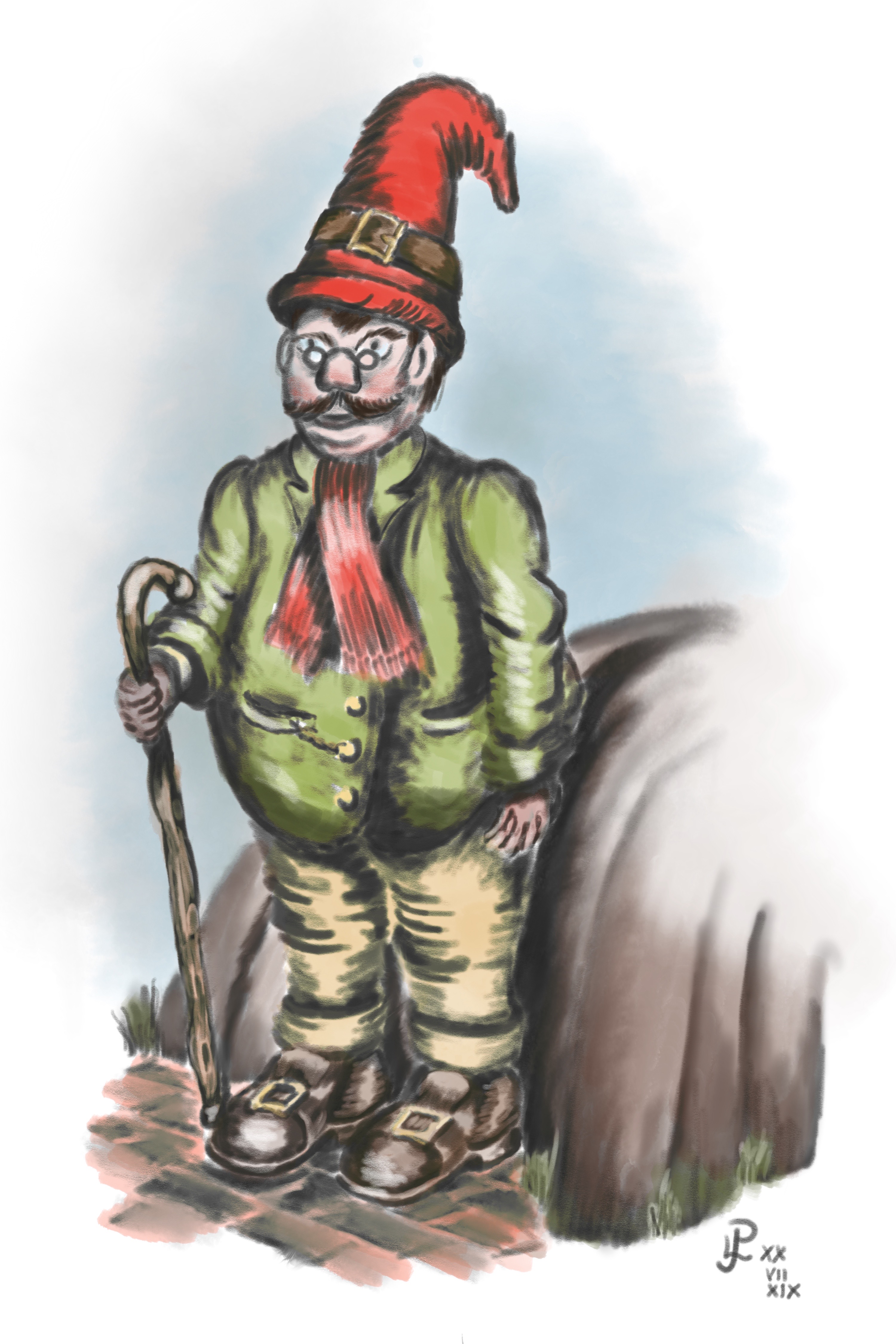
        He was created in Autodesk Sketch on an iPad Pro, using an Apple Pencil.

        Share this:

        • Email a link to a friend (Opens in new window) Email
        • Print (Opens in new window) Print
        • More
        • Share on Reddit (Opens in new window) Reddit
        • Share on X (Opens in new window) X
        • Share on Facebook (Opens in new window) Facebook
        Like Loading...
        Posted in Uncategorized | 0 Comments | Tagged gnome, sketch
      • Interesting type design…

        Posted at 1:05 am by gatf, on July 21, 2019
        There’s something about this I like.

        Share this:

        • Email a link to a friend (Opens in new window) Email
        • Print (Opens in new window) Print
        • More
        • Share on Reddit (Opens in new window) Reddit
        • Share on X (Opens in new window) X
        • Share on Facebook (Opens in new window) Facebook
        Like Loading...
        Posted in Uncategorized | 0 Comments
      • A set of lower case letter forms… a future project, perhaps…

        Posted at 1:35 pm by gatf, on July 14, 2019
        a new idea I’ve been experimenting with

        Share this:

        • Email a link to a friend (Opens in new window) Email
        • Print (Opens in new window) Print
        • More
        • Share on Reddit (Opens in new window) Reddit
        • Share on X (Opens in new window) X
        • Share on Facebook (Opens in new window) Facebook
        Like Loading...
        Posted in Uncategorized | 0 Comments | Tagged cheerful, design, font, fun, heavy, Lower case, plump, rounded, typeface
      • Numbers in Various Forms

        Posted at 12:04 pm by gatf, on April 14, 2019

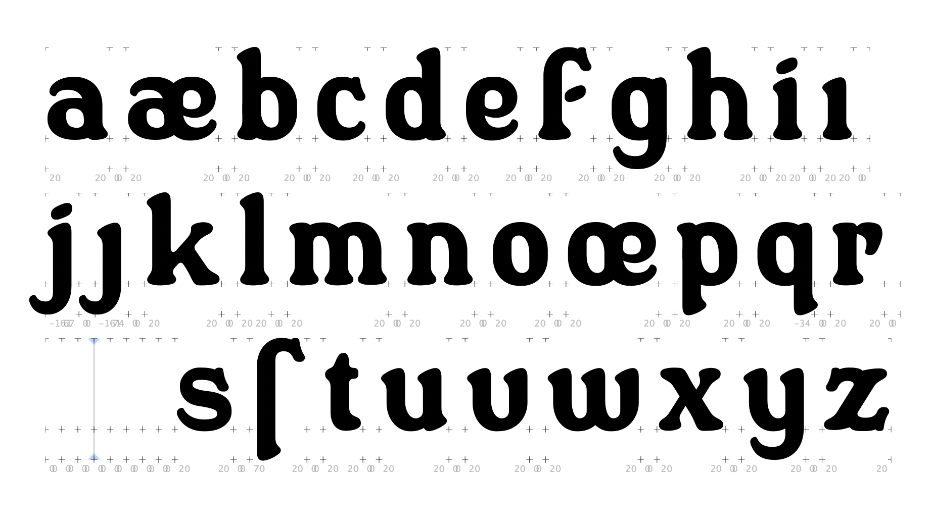
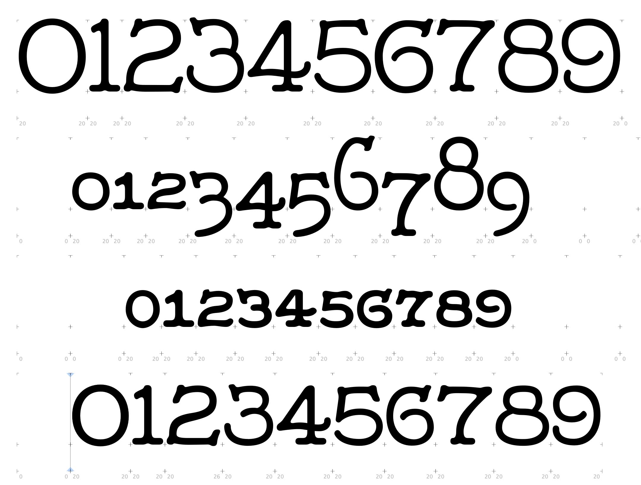
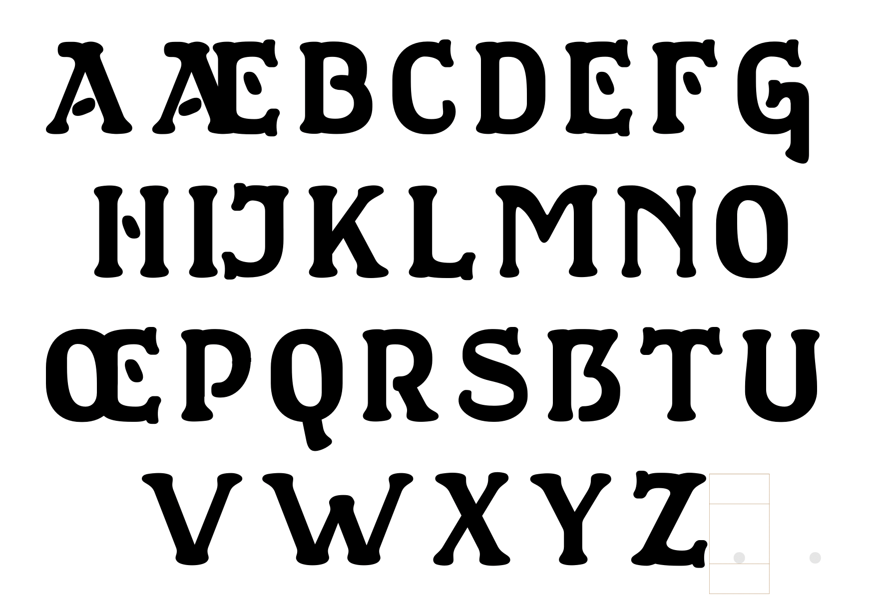
        Further progress on Draftsman Label Hand…

        Share this:

        • Email a link to a friend (Opens in new window) Email
        • Print (Opens in new window) Print
        • More
        • Share on Reddit (Opens in new window) Reddit
        • Share on X (Opens in new window) X
        • Share on Facebook (Opens in new window) Facebook
        Like Loading...
        Posted in Uncategorized | 0 Comments | Tagged design font, hand drawn, numbers, numerals, typeface
      ← Older posts
      Newer posts →
      • Keywords

        19th century 1930s 1950s 1960s anthropomorphic architectural Architecture Australia Australian bloom Blue British British Railways Broad Gauge capitals character Christmas church Cotswolds decorative design digital display Drawing edwardian England English fantasy flora flower flowers font fun Great Western Green heavy holidays hypothetical imagination landscape locomotive locomotives model oil oils painting pattern pencil Perth pink poster project railway repeating Roman sans serif seamless sketch snow steam street scene summer town toy traditional type typeface typography victorian vintage wash watercolour weathered Western Australia winter
      • Archives

      • Contact Me:

        Its just me (Paul Lloyd) Here!

        I maintain and develop this website has one purpose only, really. For me to show off my efforts in my hobby – art and design.

        If you’d like to discuss anything, or perhaps collaborate on a project together, why not email me (Paul Lloyd) at: paul@greater-albion.com


    Blog at WordPress.com.

    Greater Albion Art and Design
    Blog at WordPress.com.
    • Subscribe Subscribed
      • Greater Albion Art and Design
      • Join 320 other subscribers
      • Already have a WordPress.com account? Log in now.
      • Greater Albion Art and Design
      • Subscribe Subscribed
      • Sign up
      • Log in
      • Report this content
      • View site in Reader
      • Manage subscriptions
      • Collapse this bar
     

    Loading Comments...
     

      %d