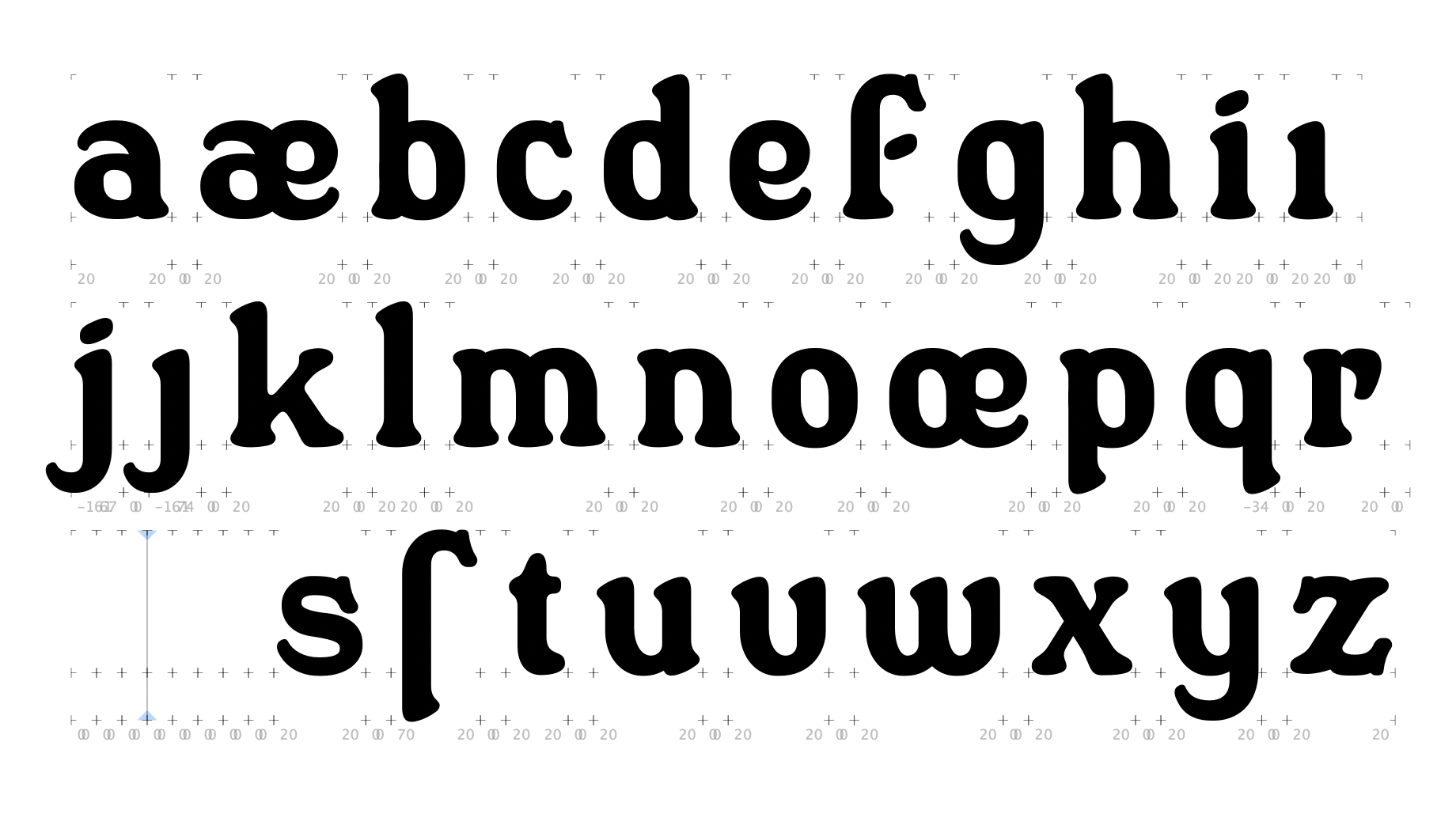
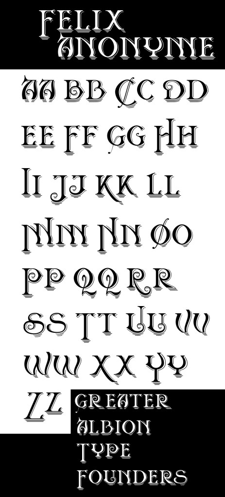

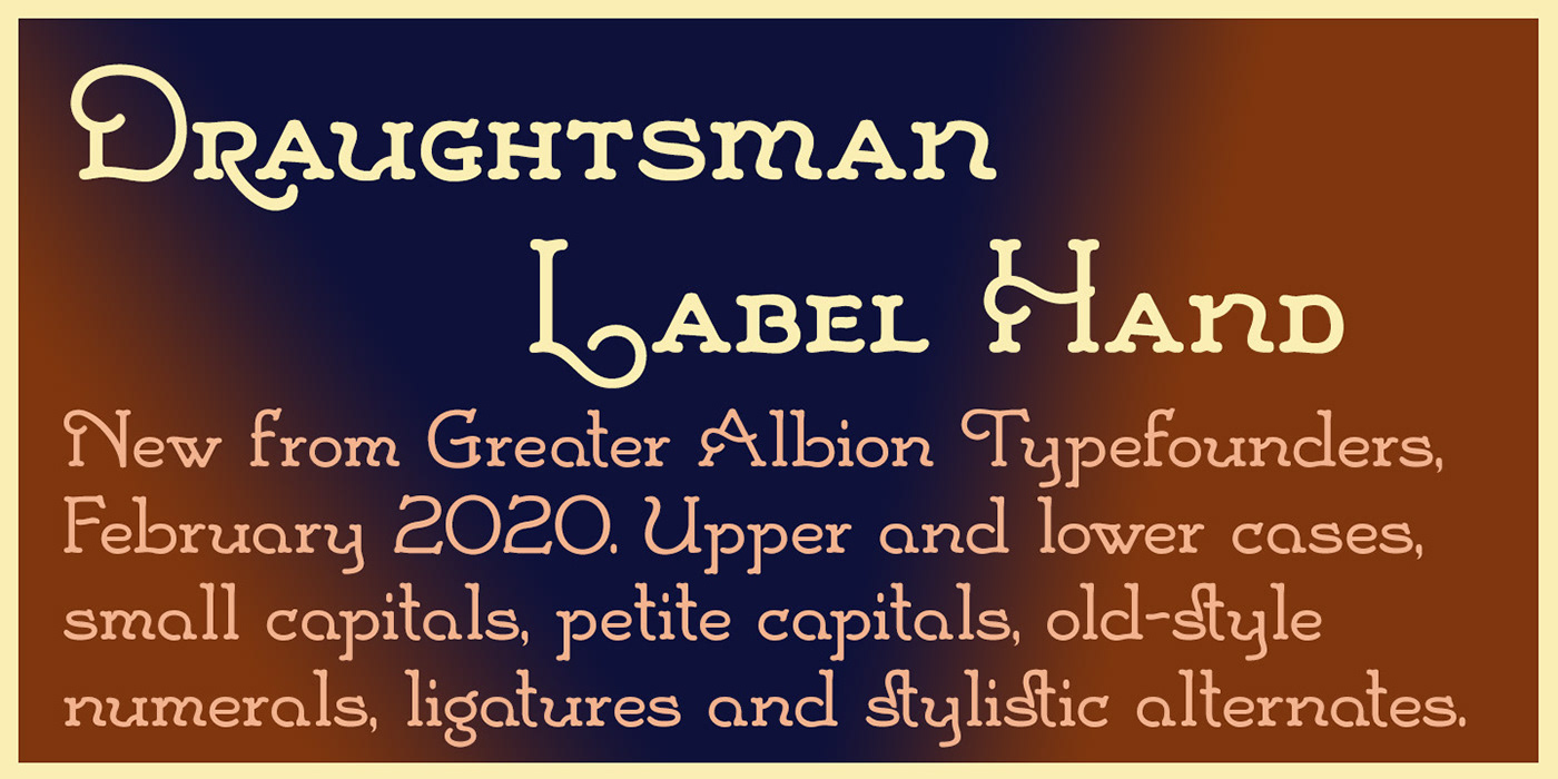
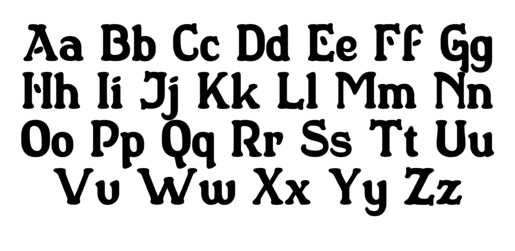
One of two typeface designs inspired by the hand lettering on a set of 19th century engineering drawings. These projects have been on the go a long time, alongside others. Just finished today!

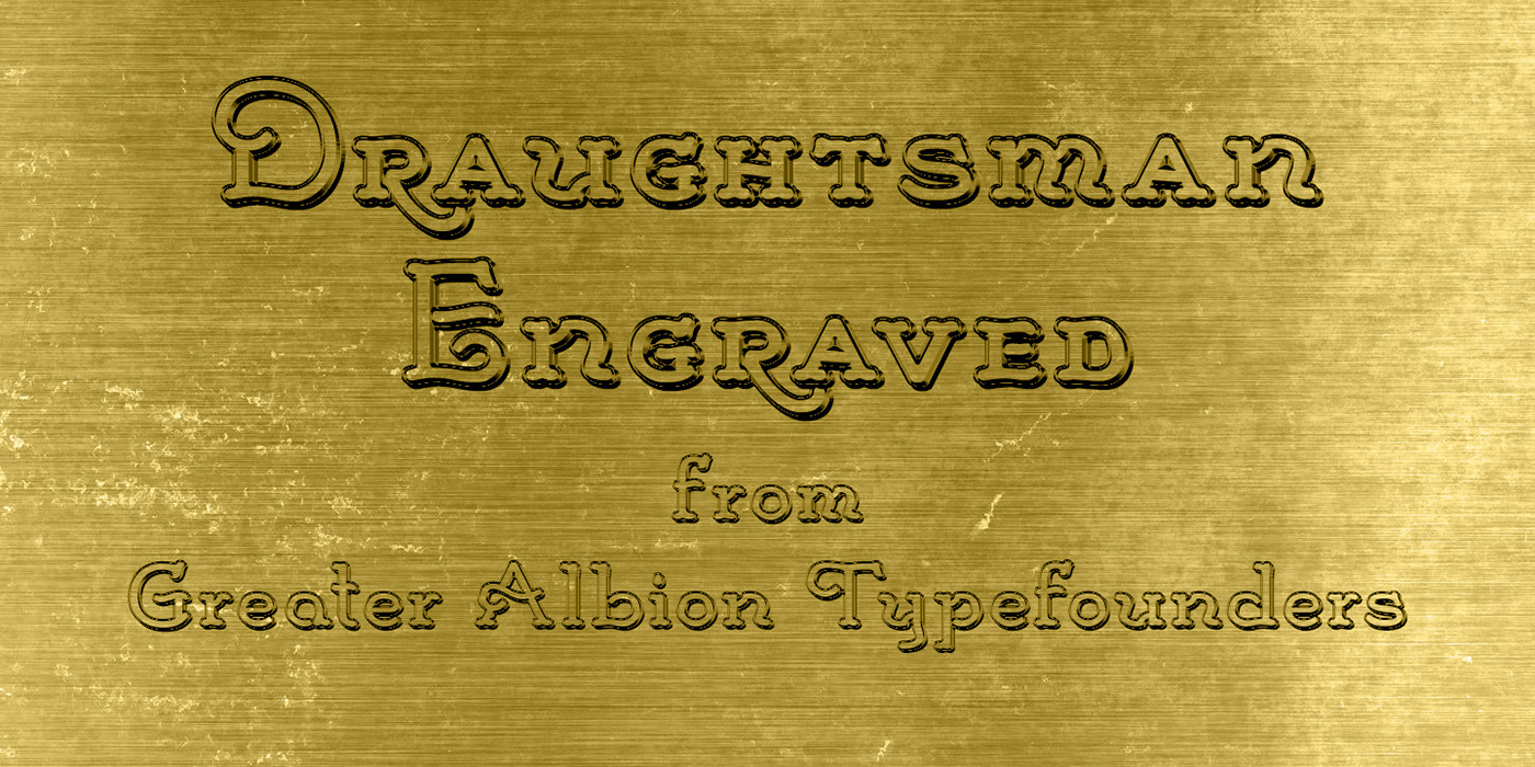


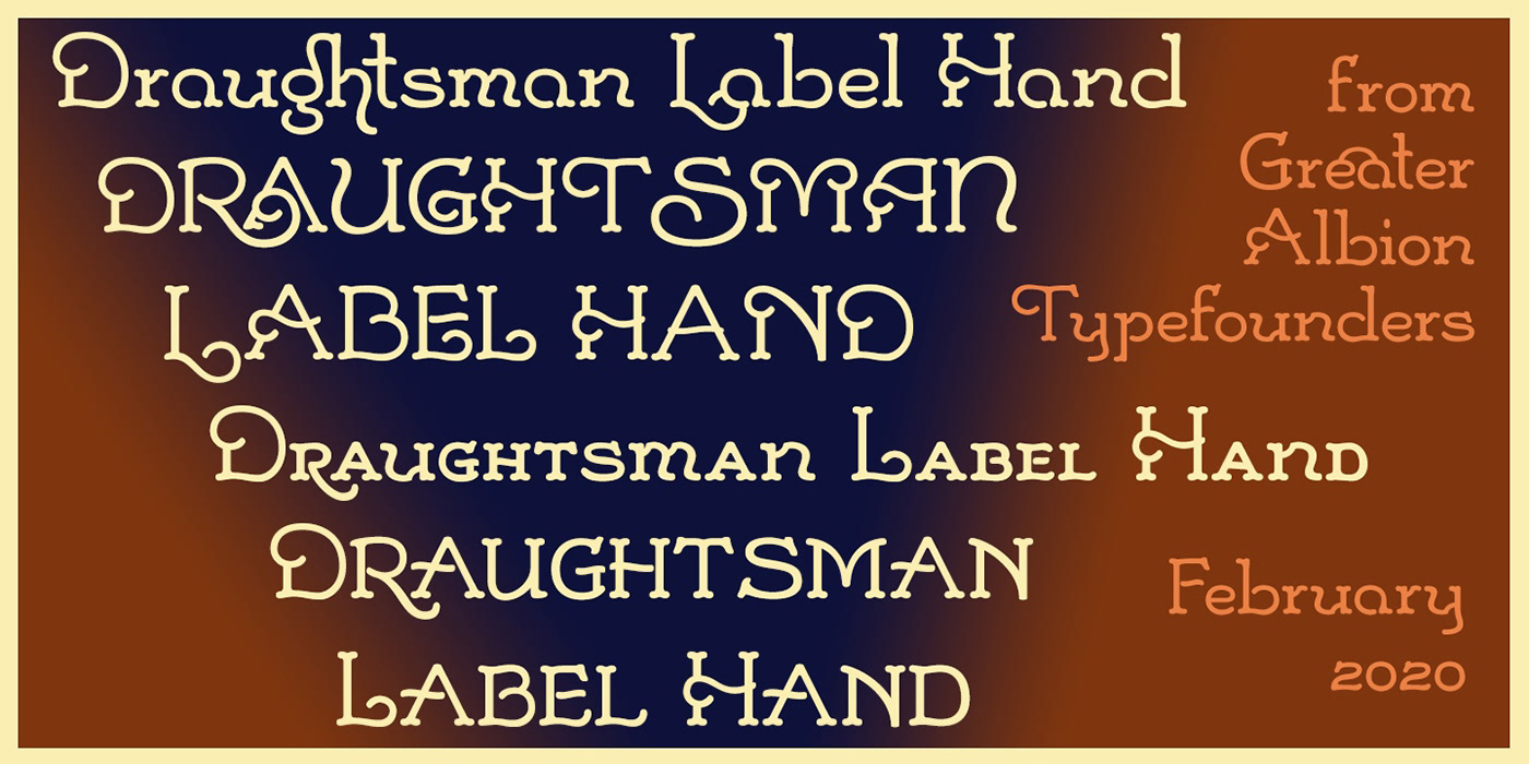
One of two typeface designs inspired by the hand lettering on a set of 19th century engineering drawings. These projects have been on the go a long time, alongside others. Just finished today!


Dewhirst Display is a family of five typefaces, inspired by a piece of traditional sign-writing which I saw while out and about.


On the evidence of this enamel Mercedes Benz advertisement, I’d tend to say yes. I think the key elements here are: the use of small capitals, a high x-height, curves that are (or appear to be) segments of a true circle and the high mid-bars of the ‘e’s. I also think I can see small rounded corners… or is that just a by-product of the enamelling process.