A different sort of repeating pattern

Another exercise in seamless repeating patters… or the never-ending town… or Paul gets inspired by M C Escher! Perhaps we should call it Castrovalva?

A different sort of repeating pattern
Another exercise in seamless repeating patters… or the never-ending town… or Paul gets inspired by M C Escher! Perhaps we should call it Castrovalva?

Mr Sherlock Bones & Dr Felix H Watson – Digital sketch with Tablet and Stylus.

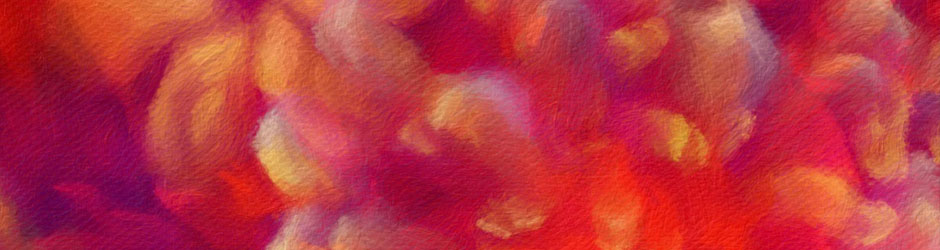
A bit of ‘fun’ painting I did the other day…


An evening spent pottering about with a repeating pattern design based o eucalyptus blooms and leaves. I like the way it becomes striped from a distance, and the seamless join.


Study Late night tinkering on the modern ‘Etch-a-sketch’… aka the iPad Pro. Study in symmetry and selective asymmetry…

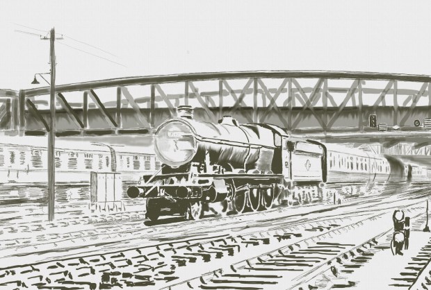
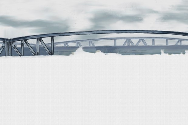
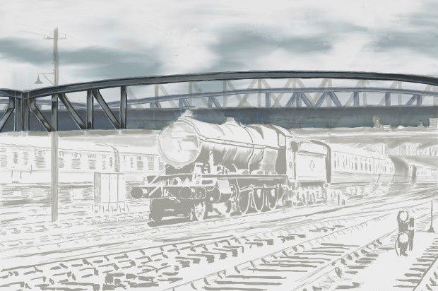
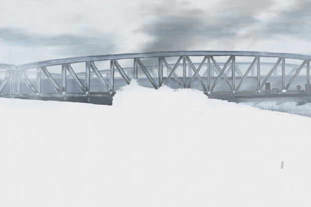
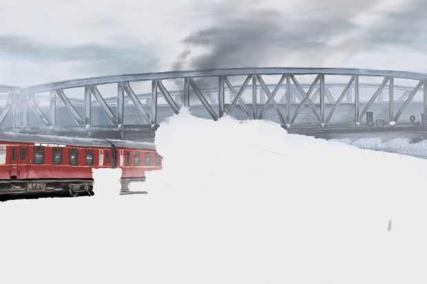
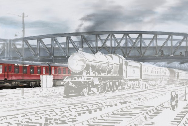
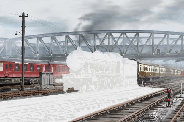
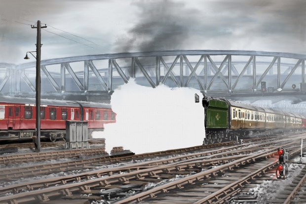
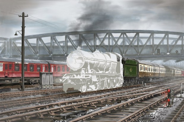
I’ve been working on this project for some weeks, and there are still some vital elements to add, but I thought people might enjoy seeing it’s evolution over time. Will post the finished worked when it’s done.